
The new Kindle ditches the raised bezel in a push toward a smaller, lighter e-reader
Amazon just gave the Kindle a makeover that feels more like a sleek smartphone than the clunky e‑reader many of us have grown to love. When you flip a page on a Kindle, a stray tap can flip the book the wrong way or open a menu, breaking the flow of reading.
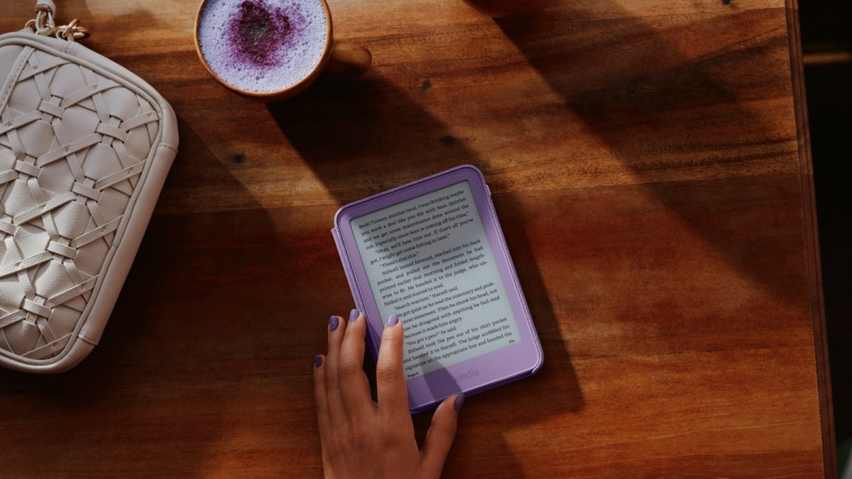
Amazon just gave the Kindle a makeover that feels more like a sleek smartphone than the clunky e‑reader many of us have grown to love. By scrapping the raised bezel that’s been a hallmark of the device for years, the company is betting on a cleaner look and a thinner, lighter profile to win back readers who have drifted toward tablets and phones. The change isn’t just cosmetic; it reshapes how users interact with the screen, how the device fits in a pocket, and even how Amazon positions its whole e‑reading ecosystem.
Why the bezel mattered — and why Amazon thinks it can disappear
The traditional raised bezel on Kindle screens served a practical purpose: it gave readers a place to rest their fingers without accidentally triggering a touch command. When you flip a page on a Kindle, a stray tap can flip the book the wrong way or open a menu, breaking the flow of reading. Amazon acknowledges that loss of that “guard rail” could be a pain point, which is why the company introduced a “dead zone” using capacitive (Cap) touch technology and haptics. As Kevin Keith, Amazon’s vice president of devices, explained at the Thursday press briefing, the device can detect a finger’s presence on the front surface and automatically adjust the active touch area, creating a virtual buffer where the bezel used to be.
In theory, that technology lets you grip the device naturally while the Kindle “knows” where your thumb is and won’t misinterpret a resting hand as a command. It’s a clever solution that leans on the same kind of palm‑rejection tech you see in smartphones, but it’s still early days. Readers will have to test whether the dead zone feels seamless or introduces a new kind of lag, especially when flipping pages in a hurry.
The new form factor: thinner, lighter, pocket‑friendly
The most obvious change is the physical profile. The standard six‑inch Kindle now measures 6.8 mm thick and weighs 140 grams, a noticeable shave off both thickness and weight compared to the previous generation. Amazon markets this as the “most pocket‑friendly Kindle” in its lineup, a claim that resonates with commuters and travelers who have long complained about the device’s bulk. The slimmer silhouette also aligns the Kindle more closely with other ultra‑thin tablets, potentially making it a more attractive secondary device for people who already own a smartphone.
Beyond the base model, Amazon rolled out an aluminum‑backed version with 32 GB of storage, available in Alpine Sky and Seaglass Green. The aluminum finish adds a premium feel while keeping the device lightweight, and the extra storage doubles the capacity for users who keep large libraries or want to store PDFs and audiobooks without constantly managing space.
Speed and display upgrades: a faster, sharper reading experience
Amazon says the new display is 30 % faster at page turns than the previous generation. While the exact benchmark isn’t disclosed, a jump of that magnitude could make the reading experience feel more fluid, especially for long sessions where a laggy page turn can become irritating. The company also touts the Paperwhite’s “largest display in the Kindle lineup” paired with the “highest contrast ratio,” promising deeper blacks, crisp text, and images that “pop off the screen” in both bright sunlight and dim bedroom lighting.
These display claims matter because Kindle’s competitive edge has always been its e‑ink technology, which offers a paper‑like feel and low power consumption. By improving contrast and speed while keeping the e‑ink advantage, Amazon is trying to fend off competition from tablet manufacturers who can now render color and video but still fall short on eye‑strain and battery life.
Pricing and color options: how Amazon is segmenting the market
The new base Kindle starts at $149.99 and launches in Ube and Graphite, two colors that lean toward the brand’s traditional muted palette while adding a fresh hue. The aluminum version, with its premium finish and larger storage, sits at the same price point but offers the new Alpine Sky and Seaglass Green shades, signaling a push toward style‑conscious consumers who want their e‑reader to look as good as their phone.
Meanwhile, the Paperwhite retains its $199.99 price for the 16 GB model in Graphite, with a 32 GB Signature Edition at $249.99 available in Graphite and Seaglass Green. The Colorsoft, Amazon’s first color e‑ink device introduced in 2024, now follows the same thin, flush‑front design. It starts at $289.99 for the 16 GB Graphite model, and a 32 GB Signature Edition runs $319.99 in Graphite and Fig. By aligning pricing across the refreshed lineup, Amazon keeps the hierarchy clear: the base Kindle for budget‑conscious readers, the Paperwhite for those who want a larger, higher‑contrast screen, and the Colorsoft for the niche that craves color without sacrificing e‑ink benefits.
Global rollout: where the new Kindle lands first
The refreshed Kindle and its aluminum variant are available immediately in a broad swath of markets: the United States, Canada, Mexico, Brazil, the United Kingdom, Germany, France, Italy, Spain, Ireland, the Netherlands, Belgium, Sweden, Poland, Japan, Saudi Arabia, the United Arab Emirates, Egypt, and Australia. This rollout mirrors Amazon’s typical strategy of launching flagship hardware in both its core English‑speaking markets and key international regions where Kindle sales have been strong.
The Paperwhite and Colorsoft are still in the preorder phase across the same territories, suggesting Amazon is using the base model as a quick‑sell to generate buzz while gauging demand for the higher‑priced variants. The Kids Kindle lineup remains available, with the standard Kids Kindle on sale and the Kids Kindle Colorsoft open for preorder in the U.S., Canada, the U.K., Germany, and Japan, indicating a continued focus on family‑friendly offerings.
What the redesign means for the e‑reading ecosystem
By stripping the bezel and introducing a dead‑zone touch system, Amazon is nudging the Kindle closer to the design language of modern smartphones and tablets. This could attract a new generation of readers who see the Kindle as a sleek accessory rather than a niche gadget. However, the success of the dead‑zone tech will be the litmus test: if it feels natural, the bezel‑free design could become the new standard; if it feels finicky, the raised bezel might make a comeback in future iterations.
Beyond the hardware, the pricing and color diversification signal Amazon’s intent to segment the market more finely. The base model remains affordable, keeping the Kindle accessible to price‑sensitive consumers, while the aluminum and Signature editions cater to power users and style‑driven buyers. This tiered approach could help Amazon defend its dominant e‑reader market share against rivals like Kobo, which have been pushing color e‑ink and larger screens.
What readers should watch for next
The bezel‑free Kindle is a bold step, but it’s only the first move in a broader push to keep the e‑reader relevant in a world dominated by tablets and smartphones. Future updates may focus on expanding color capabilities, improving battery life, or integrating deeper AI‑driven reading features—think personalized recommendations, real‑time translation, or even voice‑controlled page turns. For now, the key question for everyday readers is whether the new dead‑zone touch feels as intuitive as the physical edge it replaces.
Early adopters will likely be the commuters, students, and avid readers who prize portability and a distraction‑free screen. If the new design delivers on its promise of a smoother, faster page turn without accidental taps, it could reinforce the Kindle’s status as the go‑to device for serious reading. If not, Amazon may need to rethink the bezel‑free gamble and reintroduce a more tactile solution. Either way, the shift underscores how even a seemingly simple product like an e‑reader can become a battleground for design, technology, and user experience in the digital age.
This article was produced with AI-assisted research and editorial support. Reporting is based on the source material cited below. Sources: TechCrunch; techcrunch.com; Global1.News (01 October 2026).
By Nova Chen, Staff Writer
What's Your Reaction?
 Like
0
Like
0
 Dislike
0
Dislike
0
 Love
0
Love
0
 Funny
0
Funny
0
 Wow
0
Wow
0
 Sad
0
Sad
0
 Angry
0
Angry
0

Trend Reporter at Global1.News. Based in San Francisco, tracking the stories crossing from social platforms, forums, and community discussions into mainstream news — tech breakthroughs, cultural shifts, and world events that real people are engaging with right now.















Comments (0)